Text Styling
Typography
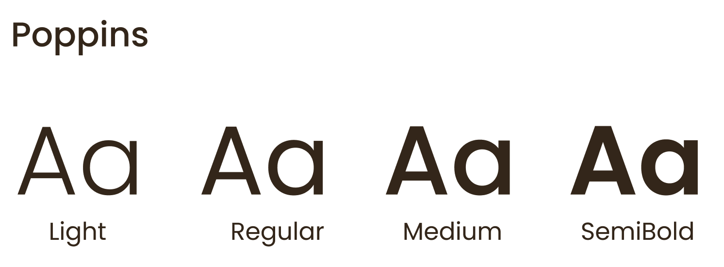
This is the typography structure we use at grainjar to organize and create hierarchies for necessary information. The primary brand typeface at grainjar is "Poppins".

Header 1 - Bold 60 pt
Heading 2 - SemiBold 32 pt
Heading 3 - Medium 24 pt
Heading 4 - SemiBold 18 pt
Body - Regular 16 pt
This is the default body text for our website.The max-width of the body paragraph is capped at 40em to optimize legibility.
Sample code < h1 > Poppins Bold 60pts < /h1 >
Sample code < h2 > Poppins semiBold 32pts < /h2 >
Sample code < h3 > Poppins Medium 24pts < /h3 >
Sample code < p > Poppins Light 16pts < /p >
Author : Joanne Kim
Bulleted list
Lists are content grouped vertically and begin with either a bullet or a number.
- Lorem Ipsum
- Lorem Ipsum
- Lorem Ipsum
Sample code < ul > < li > Lorem Ipsum < /li >< /ul >
Numbered lists
- Lorem Ipsum
- Lorem Ipsum
- Lorem Ipsum
Sample code < ol > < li > Lorem Ipsum < /li >< /ol >
Author : Joanne Kim
Basic Interactive elements
In-text link
This is an in-text linkSample code <a href ="#"> This is an in-text link </a>
Text input field / label
Forms are a group of related input which are used for submitting data. Spacing and margin should be considered to ensure legibility.
Author : Sophia Wang
Colour swatches
This is the color palette used at grainjar. Primary colors reflect the overall branding of our company and secondary colors serve as accent colors throughout the site.
Primary colors

#283D3B rgb(40,61,59) 
#EADDD0 rgb(234,221,208) 
#3A2B1B rgb(58,43,27)Secondary colors

#A00226 rgb(160,2,38)
#FFFDF4 rgb(255,253,244)
#B29770 rgb(178,151,112)
#F2F2F2 rgb(242,242,242)
#5B7A78 rgb(91,122,120)
#AFB7B6 rgb(175,183,182) Accessibility
When dealing with light text on dark backgrounds, this is the range of light colours which are utilised in text on grainjar’s signature dark green.
When dealing with dark text on light backgrounds, this is the text colour which is used on the various light colours within grainjar’s colour palette.
This is how the red accent colour is used on grainjar’s site.
Author : Joanne Kim, Clare Huang, Sophia Wang
Logo
On light backgrounds, use our full colour logo with green text
On dark backgrounds, use our full colour logo with white text
Do not
Illustrations
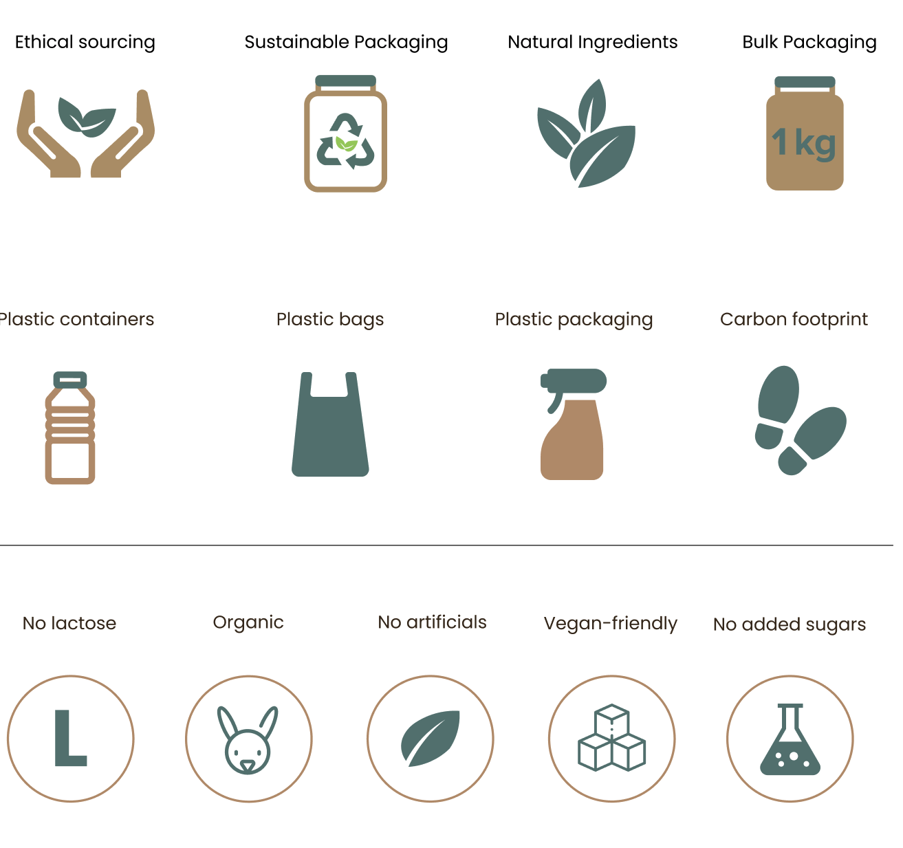
The following illustrations (top row) are drawn by Clare Huang. Illustrations are used throughout the site at grainjar to indicate important information graphically.


